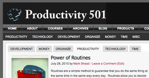
I’ve updated the design of Productivity501, please check it out and let me know what you think. In particular, let me know if you see anything that looks wrong or needs fixed. The design is similar to the original so you may not notice too many changes. The biggest differences are in the ways the site deals with images–it will now autosize images so we don’t have to do quite as much work in an image editor.
Let me know what you think! Also if anyone has suggestions for improvement, please let me know. I can’t change to match every suggestion I get, but I’d appreciate any feedback about any aspect of the site. It helps me plan ahead for the next time we revamp the design.
For anyone interested, the theme being used is Magazine from StudioPress. The previous theme was Revolution Pro Media which was a predecessor to the current theme.

You new design is neat and clean. Very easy to navigate and simple. Overall I think I like it 4 x as much as your previous design.
Since I brought up video ads as a distraction, I want to comment on the Best Way to Present them in my humble opinion.
The Best Way to Present them is Your Way, Mark. The “Three Things You Didn’t Know About Excel” ad on your home page is first-rate. Although, obviously, a link to this video would take up much less space, I can easily live with it. In fact, I clicked on it right away because I like Excel and I enjoy video instruction (demos) much more than written instruction. However, I think that both are really vital to a good overall understanding and retention of what you learn from them.
If you want to see the best tutorial that I’ve ever seen, that gives you the best of both worlds, you need to go over to Microsoft. Now, granted, I just took a quick look and didn’t follow it to the end but what I saw was amazing. The video plays at the top of the screen and the transcript of the video is shown below so if you want to follow along with what you’re hearing you can. If you need to have something repeated that you didn’t quite get, or missed, if you don’t want to rewind the video to that spot you can just look at the text. Really, you’ve got to see this to believe it. It’s awesome! This particular tutorial teaches you about Microsoft Word 2007. Here’s the link:
http://snipurl.com/ms.training.word.2007
I’m not sure what video ads you are talking about. The Excel video was definitely content–not an ad. I do have ads on this site, but they are designed to be targeted as much as possible to the individual visitor.